Flexbox
display : flex - 부모요소에 설정
Container(부모요소)에서는 item(자식요소)의 배치와 관련된 속성을 처리하고,
item에서는 자식요소의 크기 등의 속성을 처리한다.
속성
1. Container
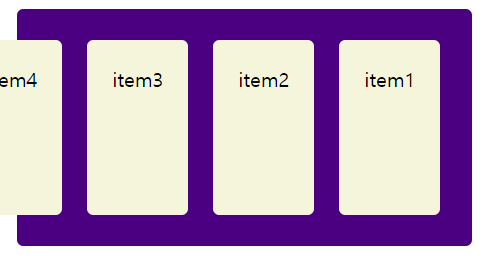
1) flex-direction 내부요소의 배치 방향
- row 기본값, 왼쪽에서부터 가로로 배치
- row-reverse 오른쪽에서부터 가로로 배치
- column 위에서부터 세로로 배치
- column-reverse 아래에서부터 세로로 배치
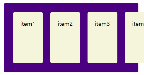
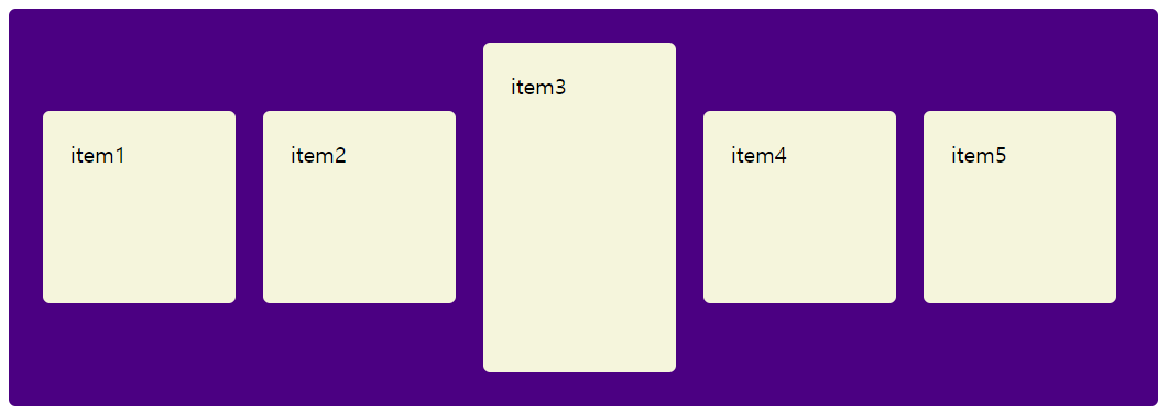
maxmids? 기준값이상 증가가 되지 않는
일정한 수준이 되면 더 이상 줄어들지 않고 삐져나온다.
item 높이 160px, container 높이 190px
2) flex-wrap 내부 요소의 줄바꿈 설정
- nowarp 감싸지 않음, 줄바꿈 안됨, 기본값
- warp 자동 줄바꿈, 넘치는 요소가 밑으로 이동한다.
- warp-reverse 자동 줄바꿈, 넘치는 요소가 위로 이동한다.

3) flex-flow : direction과 wrap을 합친 단축 속성
순서 : direction, wrap 순
예) flex-flow: row wrap;
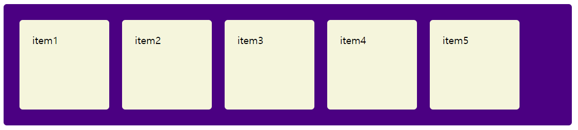
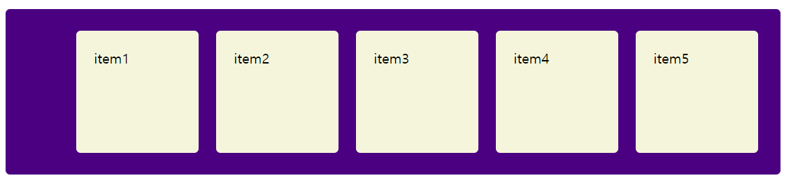
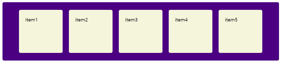
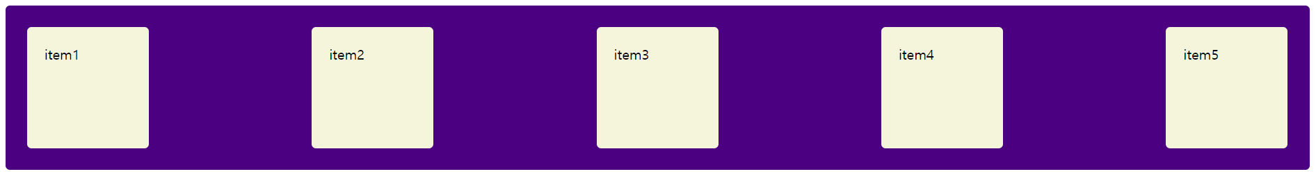
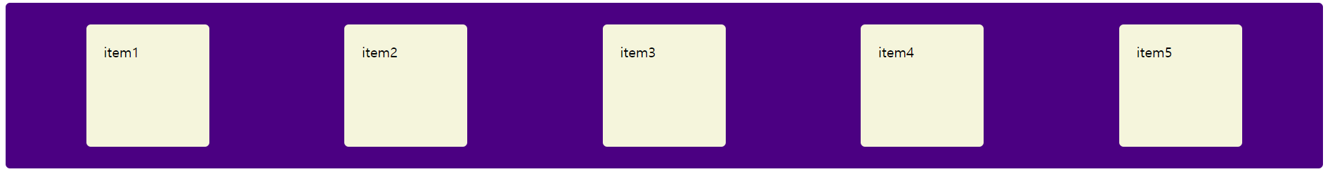
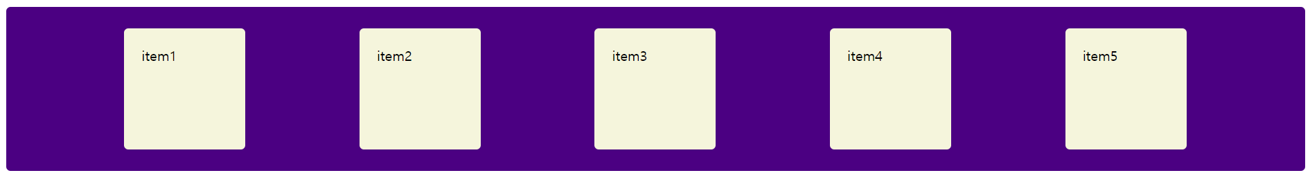
4) justify-content 가로 방향 정렬 및 여백 크기 지정
- flex-start 왼쪽 정렬
- flex-end 오른쪽 정렬
- center 가운데 정렬
- space-between 가운데 정렬 시 요소 간 간격을 동일하게, 이때 좌우 여백(margin)을 고려하지 않는다.
- space-around 가운데 정렬 시 요소 간 간격을 동일하게, 모든 좌우 여백(margin)을 동일하게 설정한다. 첫 번째 간격의 좌우를 보면 space-between과의 차이를 알 수 있다.
- space-evenly 가운데 정렬 시 요소 간 간격을 동일하게 설정한다. 브라우저 창의 좌우는 고려하지 않는다.
<!DOCTYPE html>
<html lang="ko">

<head>
    <meta charset="UTF-8">
    <meta http-equiv="X-UA-Compatible" content="IE=edge">
    <meta name="viewport" content="width=device-width, initial-scale=1.0">
    <title>flexbox</title>
    <style>
        .container {
            margin: 10px;
            padding: 15px;
            border-radius: 5px;
            background-color: indigo;
            display: flex;
            flex-direction: row;
            flex-wrap: wrap;
            justify-content: space-between;
        }
        .item {
            margin: 10px;
            padding: 20px;
            background-color: beige;
            color: black;
            border-radius: 5px;
            width: 100px;
            height: 100px;
        }
    </style>
</head>

<body>
    <div class="container">
        <div class="item">item1</div>
        <div class="item">item2</div>
        <div class="item">item3</div>
        <div class="item">item4</div>
        <div class="item">item5</div>
    </div>
</body>

</html>
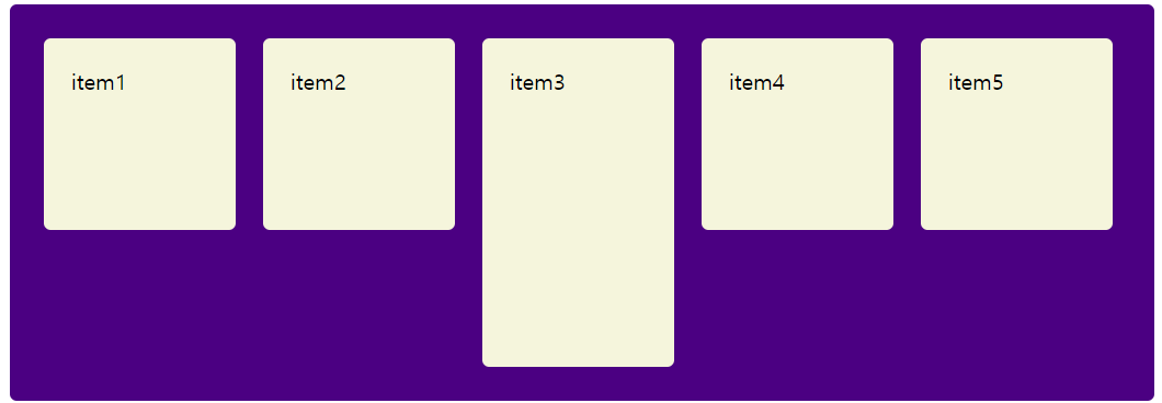
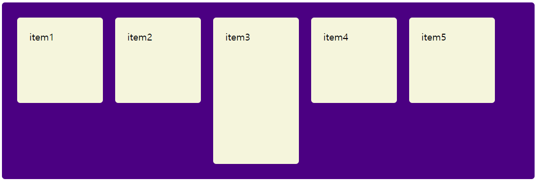
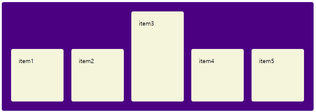
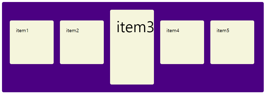
5) align-item 세로 방향 정렬 방식 지정
- stretch 컨테이너의 높이에 내부 요소의 높이를 맞춘다.
- flex-start 내부 요소들의 윗선에 동일하게 맞춰준다. 컨테이너 요소의 위쪽에 배치
- flex-end 내부 요소들의 아랫선에 동일하게 맞춰준다. 컨테이너 요소의 아래쪽에 배치
- center 내부 요소들이 컨테이너의 새로 중앙에 배치
- baseline 내부 요소 중 큰 요소의 콘텐츠(내용)를 기준으로 베이스라인에 맞춘다.
<!DOCTYPE html>
<html lang="ko">

<head>
    <meta charset="UTF-8">
    <meta http-equiv="X-UA-Compatible" content="IE=edge">
    <meta name="viewport" content="width=device-width, initial-scale=1.0">
    <title>flexbox</title>
    <style>
        .container {
            margin: 10px;
            padding: 15px;
            border-radius: 5px;
            background-color: indigo;
            display: flex;
            flex-direction: row;
            flex-wrap: wrap;
            flex-l
            justify-content: space-evenly;
            align-items: stretch;
        }
        .item {
            margin: 10px;
            padding: 20px;
            background-color: beige;
            color: black;
            border-radius: 5px;
            width: 100px;
            height: 100px;
        }
        .h-200 {
            height: 200px;
            /* font-size: 3rem; */
        }
    </style>
</head>

<body>
    <div class="container">
        <div class="item">item1</div>
        <div class="item">item2</div>
        <div class="item h-200">item3</div>
        <div class="item">item4</div>
        <div class="item">item5</div>
    </div>
</body>

</html>
6) align-content 세로 방향 여백 크기 지정
stretch, justify-content의 6개 속성값을 사용
<!DOCTYPE html>
<html lang="ko">

<head>
    <meta charset="UTF-8">
    <meta http-equiv="X-UA-Compatible" content="IE=edge">
    <meta name="viewport" content="width=device-width, initial-scale=1.0">
    <title>flexbox</title>
    <style>
        .container2 {
            height: 500px;
            margin: 10px;
            padding: 15px;
            border-radius: 5px;
            background-color: indigo;
            display: flex;
            flex-direction: row;
            flex-wrap: wrap;
            justify-content: center;
            align-content: stretch;
        }
        .item2 {
            margin: 10px;
            padding: 20px;
            background-color: beige;
            color: black;
            border-radius: 5px;
            /* width: 100px; */
        }
    </style>
</head>

<body>
    <div class="container2">
        <div class="item2">item1</div>
        <div class="item2">item2</div>
        <div class="item2">item3</div>
        <div class="item2">item4</div>
        <div class="item2">item5</div>
    </div>
</body>

</html>
2. Item 속성
1) flex-basis 우선순위가 높다.
내부 요소의 기본 크기를 지정, 외부요소(컨테이너)의 방향이 row인 너비, column이면 높이 값이 된다.
속성값
- auto : 기본값, 요소의 기본 크기(내용)
- 수치 : px, % 등으로 크기값 지정
width/height 를 사용하여 너비/높이를 지정해도 된다.(grow와 shrink가 같이 적용되어야 한다.)basis가 우선적으로 이루어지고, grow와 shirnk의 값이 지정된다. grow와 shirnk의 값을 0으로 설정하면 고정된다.
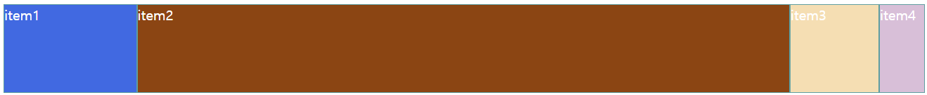
2) flex-grow 유연하게 확대하기, 아이템이 늘어나는 배율을 지정컨테이너에 여백이 있을 경우 지정한 값에 따라 자동적으로 늘어나 여백을 메운다.0 ~ 양의 정수로 설정(0은 기본값)


3) flex-shrink
유연하게 축소하기, 아이템이 줄어드는 배율을 지정(grow의 반대)
설정 값이 크면 아이템의 너비는 좁아진다.
0 ~ 양의 정수로 설정(1이 기본값)
0일 경우 flex-basis 보다 작아지지 않는, 고정된 너비를 지정할 수 있다.
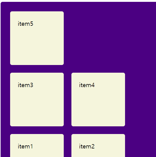
4) order 아이템 요소의 배치 순서를 결정하는 속성기본은 html로 정하고, css로 바꿀 때는 order를 사용하여 순서를 바꾼다. 순서를 바꿀 때 순서를 다 정해야 한다.
<!DOCTYPE html>
<html lang="ko">
<head>
<meta charset="UTF-8">
<meta http-equiv="X-UA-Compatible" content="IE=edge">
<meta name="viewport" content="width=device-width, initial-scale=1.0">
<title>flexbox2 item속성</title>
<style>
.container {
display: flex;
}
.item {
border: 1px solid cadetblue;
color: white;
height: 100px;
width: 100px;
flex-grow: 0;
}
.item:nth-child(1) {
background-color: royalblue;
flex-basis: 150px;
flex-grow: 1;
flex-shrink: 1;
order: 3;
}
.item:nth-child(2) {
background-color: saddlebrown;
flex-basis: 50%;
flex-grow: 2;
flex-shrink: 2;
order: 4;
}
.item:nth-child(3) {
background-color: wheat;
flex-grow: 3;
flex-shrink: 0;
order: 2;
}
.item:nth-child(4) {
background-color: thistle;
flex-basis: 50px;
order: 1;
}
</style>
</head>
<body>
<div class="container">
<div class="item">item1</div>
<div class="item">item2</div>
<div class="item">item3</div>
<div class="item">item4</div>
</div>
</body>
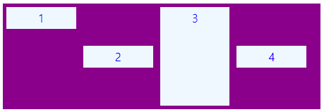
</html>5) align-self아이템 요소 개별적으로 정렬 방법을 지정
<!DOCTYPE html>
<html lang="ko">

<head>
    <meta charset="UTF-8">
    <meta http-equiv="X-UA-Compatible" content="IE=edge">
    <meta name="viewport" content="width=device-width, initial-scale=1.0">
    <title>flexbox2 item속성</title>
    <style>
        .cont {
            width: 450px;
            height: 150px;
            background-color: darkmagenta;
            bordre: 1px solid red;
            margin-bottom: 20px;
            display: flex;
            align-items: center;
        }

        .box {
            padding: 5px 45px;
            margin: 5px;
            background-color: aliceblue;
            color: blue;
            /* height: 50px;
            line-height: 50px; */
        }

        .box:nth-child(1) {
            align-self: flex-start;
        }
        .box:nth-child(3) {
            align-self: stretch;
        }
    </style>
</head>

<body>
    <div class="cont">
        <div class="box">1</div>
        <div class="box">2</div>
        <div class="box">3</div>
        <div class="box">4</div>
    </div>
</body>

</html>
플렉스 참고 자료
이번에야말로 CSS Flex를 익혀보자
이 튜토리얼은 “차세대 CSS 레이아웃” 시리즈의 첫번째 포스트입니다. 이번에야말로 CSS Flex를 익혀보자 이번에야말로 CSS Grid를 익혀보자 벌써부터 스크롤의 압박이 느껴지고,‘좀 편안하게 누
studiomeal.com
자주 사용할 수 있도록 여러 번 반복해서 사용해 보는 것이 필요하다.
'공부기록 > CSS' 카테고리의 다른 글
| vue3 타입스크립트 툴팁 만들기 (0) | 2024.05.31 |
|---|---|
| 2월 27일 (1) CSS - transform, transition (0) | 2023.02.27 |
| 2월 23일 (2) CSS selector 2, z-index, display, flex (0) | 2023.02.23 |
| 2월 23일 (1) CSS clear, selector1 (0) | 2023.02.23 |
| 2월 22일 (2) CSS 공간 처리 (0) | 2023.02.22 |


